Pilote Media’s branding team has created a new corporate identity for the travel destination based podcast network, Sense in the City The project has launched podcasts in Sydney Australia, Athens Greece and Dubai has also been announced.
The brief was to create an instantly recognisable logo that could be scaled to include new cities as they were launched. The logo also had to work as a small icon – as that is where it would be seen most often – in podcasting apps.

Bold and Sensual
The final Sense in the City brand features a stylised city skyline created by the silhouette of a face looking down, being immersed in the place. The head brings the senses of smell, taste, sight and hearing. The word Sense is flowing and casual in fresh teal.

Scalable
As with most modern day brands, the Sense in the City identity will need to be rendered in multiple sizes on multiple coloured and textured backgrounds.
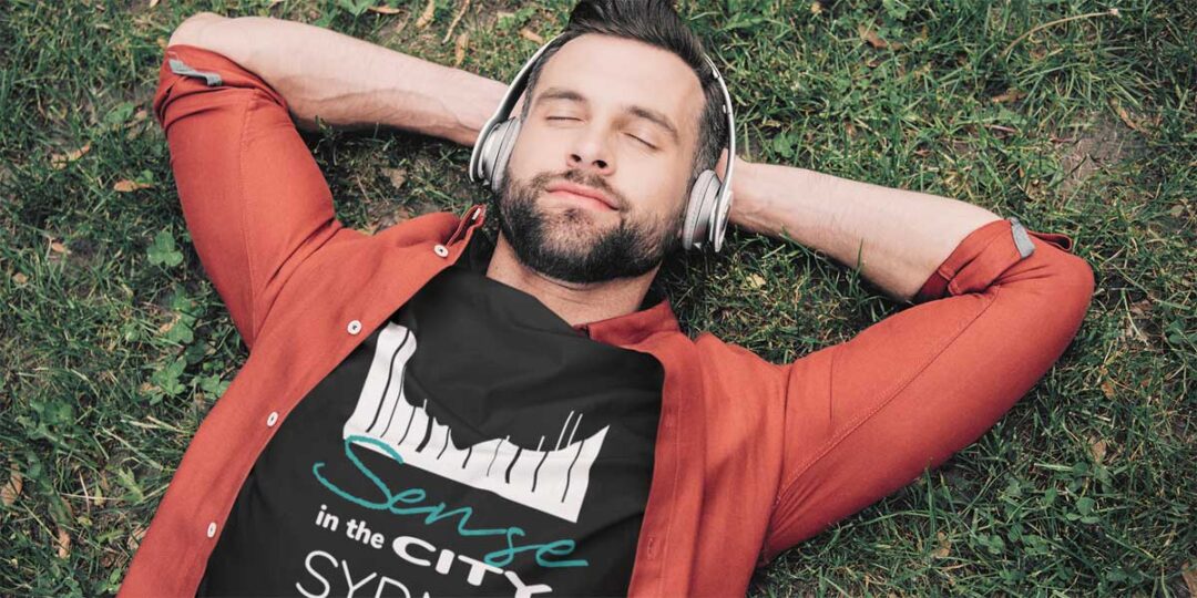
It needs to be able to be converted to an image that can be embroidered onto polo shirts and printed onto travel mugs.
The Creative Process

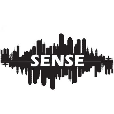
Early versions of the Sense in the City brand included a city skyline mirrored to create the image of a soundwave. Several different fonts and typologies were tested – the founding team are artists and creatives and didn’t want something too corporate.
As a podcast, the corporate identity of the brand includes theme music and sound effects. A wide range of brand assets were created including header images for Linkedin and other social media.
“Working with Pilote Media developing the Sense in the City brand was exciting. It was particularly fun creating a logo that refers to the senses, the podcast and intimate, personal experiences within the big city. It’s subtle – some people don’t see the face at first, but that’s fine. The whole concept of Sense in teh City is about discovery and delightful surprises. So far we’ve had a great response…”
Ruby Boukabou – Founder, Sense in the City / Ruby TV
Pilote Media will also provide production support for the Sense in the City podcasts.

